
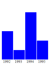
In this article you’ll learn the basics of creating charts using svg and D3. Above is what we’ll be creating by the end of this tutorial.
svgBefore proceeding further it’s noteworthy to have a quick overview of how to create charts using svg and rect tag.
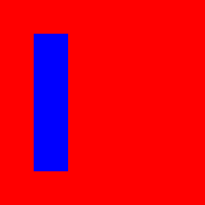
Consider the below code.
The output of above code will be as below.

Nothing fancy here.
svg with width 300px and height 300px. We gave it red background color using CSS.rect inside it with width 50px and height 200px. We filled it with blue background color.Note that inside rect is stuck to top left. Now let’s add x and y property to inside rect.
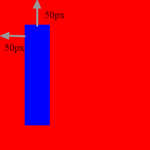
The output of modified code is as below.
Notice that the inside rectangle has moved 50px to right and 50px below. So whatever values are given in x and y are relative to outer svg’s top left corner.
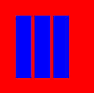
Now let’s add two more rect tags with same width and height but different x and y.
Note that x for second rect should start after x for first rect + width of first rect + some spacing.
Same logic applied for the third rect.
So modified code is as below.
Below is the output of above code.
But wait. In real world scenario all bars can’t be of same height. So let’s go ahead and change the height of last two rect.
Here’s the output of above code.
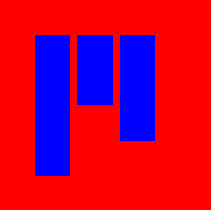
That’s not how it is supposed to look, right?
And you already know why 🙂
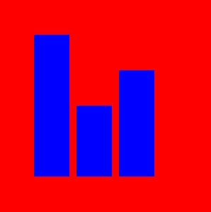
The y attribute is calculated from top. So we need to re-calculate y attribute for every rect using below formula:
{y attribute of rect} = {svg height} - {bottom spacing} - {height of rect}
bottom spacing will be used later for adding labels or X-Axis value.
So accordingly consider the second rect.
y = 300 (svg height) – 50 (bottom spacing) – 100 (height) = 150.
Further to this below is the modified code.
And here’s the output.
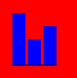
Now let’s add a bottom X-Axis. We’ll use line tag for this.
line tag accepts start point as x1 and y1 attributes.We need to start our X-Axis from the bottom start of first rect and it should end at bottom end of third rect.
So after adding the line tag the modified code looks as below.
Above code will give you an output as below.
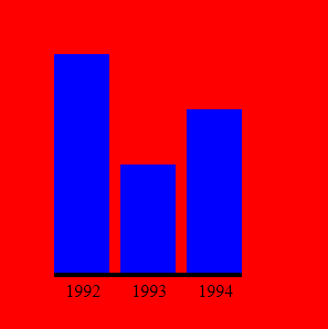
It’s time to add some labels. So let’s label the three bars as Mon, Tue and Wed. We’ll use the text tag for this. Below is typical usage of it.
Some text So we’ll use three text tags; one for each rect.
Modified code with text tag added looks as below.
Final output.
This is how you can create a bar chart using svg.
Now we’ll be using this technique combined with D3 to dynamically create charts from a list of values.
So given a list say [30, 10, 50, 20] we’ll be creating a bar chart for this using svg and rect as explained but dynamically using D3.
To install D3 you simply need to include a single js file. In this tutorial we’ll use the cdn link https://d3js.org/d3.v4.min.js.
Consider below html markup.
It’s a simple html document with D3 script and a p tag.
Save it in a html file and open it in a browser. You should see a blank screen as it contains nothing but an empty div.
Add below code in the last script tag before closing body.
d3.select("body")
.append("h1")
.text("Hello world")
If you refresh your browser you should see “Hello world” in bold text.
If you right click and inspect the body tag you’ll see a h1 tag containing “Hello world”.
So if you know JQuery already this shouldn’t be anything surprising for you.
Now let’s replace the above code with below one.
d3.select("div")
.selectAll("p")
.data([30, 10, 50, 20])
.enter()
.append("p")
.text("Hello")
If you refresh your browser you’ll get below data in your browser window.
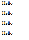
If you right click and see the content inside the div you’ll find 4 p tags containing Hello text.
Now let’s change the append("p") to append("h1"). So modified code is as below.
d3.select("div")
.selectAll("p")
.data([30, 10, 50, 20])
.enter()
.append("h1")
.text("Hello")
Refresh your browser and you’ll something as below
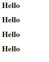
If you right click and see the content inside div tag this time you’ll see four h1 tags instead of p tags.
Now let’s modify the list inside data and add one more element to it. So from [30, 10, 50, 20] change it [30, 10, 50, 20, 40].
d3.select("div")
.selectAll("p")
.data([30, 10, 50, 20, 40])
.enter()
.append("h1")
.text("Hello")
Refresh your browser. This time you’ll see one more h1 tag.
Now say if we want to access the data and the index of the data inside the dynamically appended text.
Well the text method above can accept a closure function too. The function will be passed two params. First is the element of data and second is it’s index.
d3.select("div")
.selectAll("p")
.data([30, 10, 50, 20, 40])
.enter()
.append("h1")
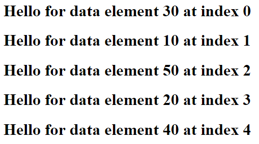
.text((d, i) => `Hello for data element ${d} at index ${i}`)If you refresh your browser you get something as below.
Once after you read this article you can go through this tutorial series on Tutorials point to get deep insight on how d3 works.
Replace the code inside the ending script tag with below one.
const svg = d3.select("body")
.append("svg")
.attr("fill", "red")
.attr("width", 300)
.attr("height", 300);
We just added a svg tag to body.
Now append below to above code.
const bar_width = 50;
const bottom_offset = 50;
svg.selectAll("g")
  .data([30, 10, 50, 20])
  .enter()
  .append("rect")
  .attr("fill", "blue")
  .attr("height", (d, i) => d)
  .attr("x", (d, i) => bar_width * i)
  .attr("y", (d, i) => 300 - bottom_offset - d)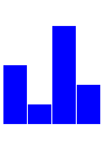
.attr("width", bar_width - 2);If you refresh your browser below is what you get.

Well all looks good but it’s the height of the bar. We are using the data as the actual height of the bar. We should fix this.
We’ll use d3’s scaleLinear() for this. It will help us convert our data values on a scale of 0 to 200.
Here’s a good read on scale functions. You can read it after you are done with this article.
const scale = d3.scaleLinear();
scale
  .domain([0, 50])
.range([0, 200]);[0, 50].We’ll be replacing .attr("height", (d, i) => d) in previous code with .attr("height", (d, i) => scale(d)).
Also we’ll have to replace .attr("y", (d, i) => 300 - bottom_offset - d) with .attr("y", (d, i) => 300 - bottom_offset - scale(d))
So modified code is as below.
svg.selectAll("g")
  .data([30, 10, 50, 20])
  .enter()
  .append("rect")
  .attr("fill", "blue")
  .attr("height", (d, i) => scale(d))
  .attr("x", (d, i) => bar_width * i)
  .attr("y", (d, i) => 300 - bottom_offset - scale(d))
  .attr("width", 50 - 2);
Below is the output after refreshing browser.
Now it’s time to add X labels. So let’s have another list ['1992', '1993', '1994', '1995']; containing labels for each data element.
Using the same logic for adding rect let’s add the text too.
svg.selectAll("g")
  .data(['1992', '1993', '1994', '1995'])
  .enter()
  .append("text")
  .attr("dominant-baseline", "text-before-edge")
  .attr("fill", "black")
  .attr("x", (d, i) => bar_width * i + 5)
  .attr("y", (d, i) => 300 - bottom_offset)
.text((d, i) => d);dominant-baseline to text-before-edge makes sure it’s x,y position are captured from it’s top left.Below is output.
Here’s the final code.
The chart that we developed here is a very basic one. However if you are interested to dive in further you can have a look at this example chart on github page we created. This is further to what we learnt in this article. We have used D3 transitions and events such as mouseover and mousemove.